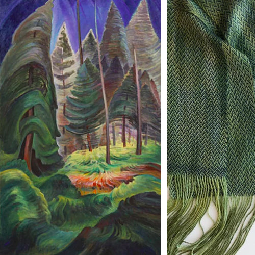
The "Monday Morning" study group at the Edmonton Weavers' Guild did a collective project where they each decided to make a weaving in response to the Emily Carr Painting, "A Rushing Sea of Undergrowth". Using the colours, textures and feeling of the painting as a starting point, the weavers each explored their own interpretations of the painting. Take a look at all of the different projects that came out of this!

Libby Bolster
Handwoven scarf

Catherine Melnychuk
"Forest Kaleidoscope"
This scarf was inspired by the colour palette of the painting and the way colours and shapes change around us as we walk through a forest.

Catherine Melnychuk
"Forest Clearing"
This scarf is meant to evoke the dappled colours and texture of foliage in the forest clearing centred in the painting. The scarf is woven in Tencel to reflect the light. Catherine used an odd weave called turned Bronson Lace to create a textural feel to the scarf.

Catherine Melnychuk
"Harmonic Chaos"
Nature is both structured and random simultaneously. This shawl embodies those contracts. The weave structure is a combination of tuned twill and broken turned twill on 16 shafts. Catherine wove with a thick and thin Peruvian highland wool/alpaca/silk yarn to introduce a further randomness when compared to the harder edges of the basic geometric design. The colours are a play on the notion of shadows and light.

Nancy Taschuk
Nancy wove a rug to resemble the yellow and green colours of the Emily Carr painting. The dark warp ends resemble the trees and the dark border represents the forest floor.

Jen Black
A hand painted warp and hand dyed weft, 2/10 tencel

Mary-Lou Hogg and Mary-Ann Hawrelyk
Details from Mary-Lou: A 4 shaft summer and winter weave in cotton. This piece is Mary-Lou's first attempt to use a painting as an inspiration to design a weaving. She loved all the colours and decided to use many of them in her piece. She chose 'summer and winter' as she thought it would show he horizontal and vertical lines of the photo with bold colours showing in the foreground and background.

